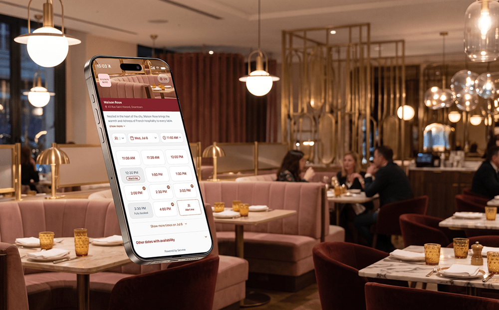
Every reservation starts with a decision. A guest finds your venue, checks availability, and either completes the booking — or doesn’t. For operators without the right tools, that gap is often invisible: there is no notification when someone considers booking a table but leaves without completing the process. The cover stays empty and the reason stays unknown.
In an industry where profitability runs on consistent footfall, a booking experience that doesn’t convert interested guests is a clear problem.
As a data-driven reservation technology platform, Servme has a clear view of where online booking flows lose guests and what it takes to keep them moving toward a confirmed seat. The friction points are not a mystery. And the new Servme booking widget, live today, raises the bar on each of those moments.
Where Guests Drop Off
The scale of the problem is easy to underestimate. A 2025 Toast survey found that 44% say they find a restaurant less appealing — and stop trying to book — when it’s too difficult to get a reservation. That’s not guests who had a bad experience at the venue. That’s guests who never arrived because the process of getting there put them off.
Drop-off in online reservation flows tends to cluster around two broad patterns. The infographic above maps the specific friction points, but two themes are consistent across venue types and markets.
- What the guest sees. Guests make snap decisions about whether a booking is worth completing based on what’s immediately in front of them. The visibility and clarity of information matters as much as the information itself. If availability or time slots are difficult to find, a significant share won’t stay to find out. Similarly, a deposit or prepayment requirement that appears at the confirmation step — after a guest has already spent several minutes working through the flow — comes as an unwelcome surprise and triggers a reassessment of the whole process. Many guests just abandon the booking.
- How the process feels. Speed and simplicity are the baseline expectation in any consumer app a guest uses daily. The booking flow isn’t competing only against other restaurants; it’s competing against every smooth digital transaction a guest completes. A flow that takes too long, asks for information that doesn’t feel necessary, or hits dead ends without offering alternatives erodes confidence before the guest has arrived. Each extra step is a decision point: another moment where closing the tab is easier than continuing. For hotel F&B teams, this is especially consequential. A hotel guest researching dinner from their room is already a captive audience, but the bar for losing them is lower than it appears. Room service and delivery apps are one tap away. If the booking screen stalls them, the venue has already lost to the path of least resistance.
How the New Widget Addresses Friction Points

The redesign is built around four principles that directly address these patterns.
- Visibility. The essential information — date, time, availability, party size, etc. — is on the first screen. Guests don’t navigate through multiple steps before they can see whether your venue has what they’re looking for. The faster a guest can confirm there’s a slot that works for them, the more likely they are to keep going.
- Transparency. Payment terms, deposit requirements, and booking conditions are shown upfront, not at the confirmation step. This changes the dynamic significantly: a guest who sees a deposit requirement at the start makes an informed decision and follows through. A guest who discovers it after several minutes of completing a form reassesses whether the booking is worth it — and often, just leaves. Transparency at the right moment isn’t just good practice; it’s a conversion lever.
- No Dead Ends. When a requested time slot isn’t available, the widget surfaces alternatives automatically: other times or, for restaurant groups, other locations. A guest who sees options is a guest who stays in the flow. A guest who sees a “no availability” message with nothing else closes the tab and finds another restaurant to book from. The difference between those two outcomes is often a single redirect that the booking system either offers or doesn’t.
- Brand Experience. Every screen in the widget, from the opening view to the booking confirmation, carries your venue’s visual identity: colors, logo, cover image, font. This matters beyond aesthetics. A guest who moves from your website or social presence into a booking flow that looks and feels like your venue stays in the same mental frame. A generic third-party form creates a break in that experience — a small one, but enough to introduce doubt at exactly the moment you need the guest to confirm.
You Have Full Control
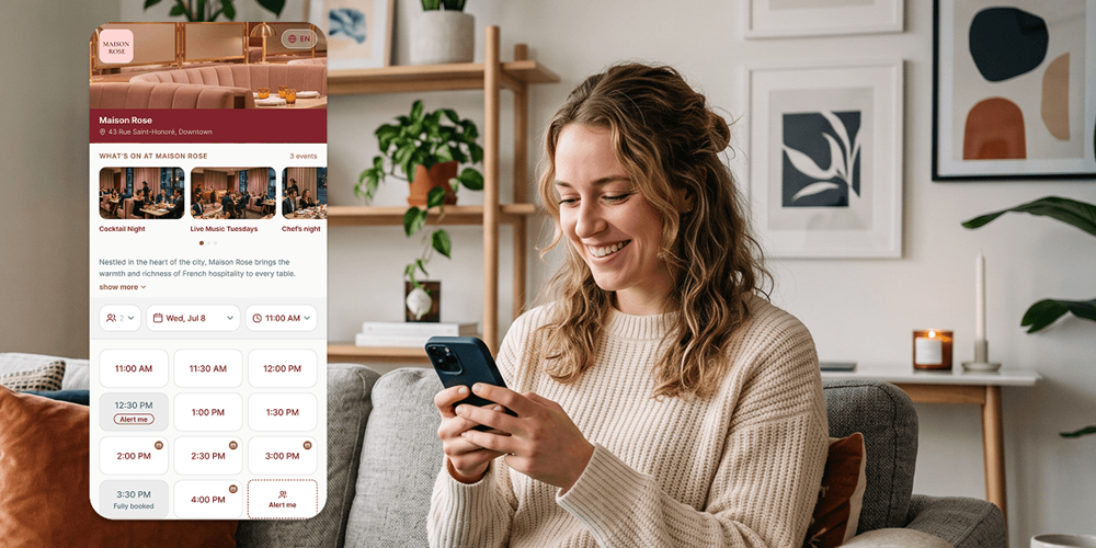
The widget is configured across four areas.
- Brand Identity. A guest who reaches the booking stage is already interested. A widget that looks and feels like your venue — your colors, your logo, your imagery — reinforces that interest and builds the trust that gets reservations over the finish line. A generic booking form does the opposite: it signals a gap between the brand the guest discovered and the experience they’re being asked to trust.
- Booking Rules. Different venues have different service models, and the widget should reflect yours. Whether you collect specific guest preferences, how you display full or partially available slots, whether your waitlist is open, and how multiple venues in your group appear in a single link — these are operational decisions that belong to you, not to a default setting.
- Messaging. The widget is often the first direct communication a guest has with your team. What it says, and how it says it, sets expectations for the visit before the guest arrives. Writing that copy in your own voice — the header, the guest-facing text, the post-booking confirmation — is the difference between a reservation process that feels like your venue and one that feels like a form.
- Booking Source Tracking. Knowing that a guest booked is useful. Knowing which channel drove that booking is what lets you invest marketing spend where it actually converts, rather than where it generates the most traffic. Unique tracked links per channel, connected to Google Analytics or Facebook Ads Manager, close that gap, so every reservation has a source and every channel has a measurable return.
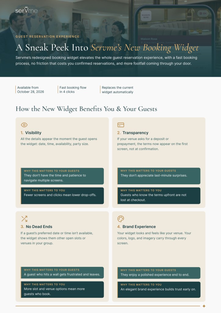
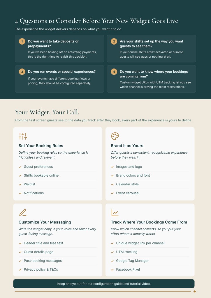
The widget is live today. For a full walkthrough, download our widget step-by-step guide below.
And once your widget is converting more guests, the next step is keeping them. Turning first-time guests into regulars is where the long-term revenue sits.
Discover Servme’s new booking widget and embrace a superior guest reservation experience.